
next week assignment
photography: play with the camera..
videography: prepare the content and read the notes
web design: - study on client's current website, gather all necessary materials
eg: target audience, advantages and disadvantages
- case study on 3 competitor websites
- idea development and sketches
- create project sitemap (how many pages you want to do)
-comment on friends blog
Friday, May 23, 2008

Tuesday, May 20, 2008
web analysis
1. Oriflame
this website is about selling cosmetics. in this website they arrange the information in category to easy get the information. they use a lot of image to show their products.
there are 4 menu, it is drop down menu and also have a quick navigation to find the product that they want. for the menu button is still same only the content change.
in product page they also divide the product to many category, such as for men, for children, fragrance etc, and also have the explanation about the product
in every page they still using the same color and the logo on the top.


 for the grid system, it use 2 columns and 3 columns.
 this is 3 column

2 columns
2. panasonic
for this website,the main page is show the product and the main menu is in right hand side.it also divide the information in category. there are 3 main menu.
when go inside the sub menu, the main menu button is on top and also the sub menu button.
i think people will confuse to find the main menu button, because its quite small and the color almost same with the background color.
for very page it still using the same background and same color.
for consumer electronics page, it has 3 section, shop and compare, learn about it and get support.
the color of the sub menu button will change when you go to the 3 section.
and also have a quick navigation to find the product.
main page


the sub menu button change to green color when in shop and compare section
for the grid system

for the business page and industrial page is different with consumer page, its change the layout and the color but still have the panasonic logo.

3. bestwestern hotel
this is hotel website, but its give a lot of information. they also arrange the information into category. for the button is same with other pages and only the content change. it still use the same background and same color, when you in other page, the button will change to dark blue to tell where are you in now. in every page there is 1 column for find a hotel and reservation, is to make people easy to make reservation for the hotel and no need to go back to homepage.
i think for this website the information very well. they also give information how to travel with pets, with kids and planning tips. all are under trip planner menu,
its also have other information about weather, time and currency.
main page


this the package menu, it show all the country to help people easy to find.

for the grid system

this website is about selling cosmetics. in this website they arrange the information in category to easy get the information. they use a lot of image to show their products.
there are 4 menu, it is drop down menu and also have a quick navigation to find the product that they want. for the menu button is still same only the content change.
in product page they also divide the product to many category, such as for men, for children, fragrance etc, and also have the explanation about the product
in every page they still using the same color and the logo on the top.
main page


 for the grid system, it use 2 columns and 3 columns.
 this is 3 column
2 columns
2. panasonic
for this website,the main page is show the product and the main menu is in right hand side.it also divide the information in category. there are 3 main menu.
when go inside the sub menu, the main menu button is on top and also the sub menu button.
i think people will confuse to find the main menu button, because its quite small and the color almost same with the background color.
for very page it still using the same background and same color.
for consumer electronics page, it has 3 section, shop and compare, learn about it and get support.
the color of the sub menu button will change when you go to the 3 section.
and also have a quick navigation to find the product.
main page


the sub menu button change to green color when in shop and compare section
for the grid system

for the business page and industrial page is different with consumer page, its change the layout and the color but still have the panasonic logo.

3. bestwestern hotel
this is hotel website, but its give a lot of information. they also arrange the information into category. for the button is same with other pages and only the content change. it still use the same background and same color, when you in other page, the button will change to dark blue to tell where are you in now. in every page there is 1 column for find a hotel and reservation, is to make people easy to make reservation for the hotel and no need to go back to homepage.
i think for this website the information very well. they also give information how to travel with pets, with kids and planning tips. all are under trip planner menu,
its also have other information about weather, time and currency.
main page


this the package menu, it show all the country to help people easy to find.

for the grid system

Sunday, March 23, 2008


Sunday, March 16, 2008
web design
this is my interface for tutorial website..
 this is for main page
 this is product page
 this is about clay
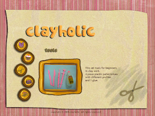 this is for tools page
 tutorial page
 contact page
and here have 2 different paper for the background, still dont know which one i want to use..


and thats all.. please give some comment ya...tq hehhehe....:)
 this is for main page
 this is product page
 this is about clay
 this is for tools page
 tutorial page
 contact page
and here have 2 different paper for the background, still dont know which one i want to use..


and thats all.. please give some comment ya...tq hehhehe....:)
Tuesday, March 4, 2008
navigation analysis
1.Meet sarah hyland
for this site the navigation very simple and still using the same background, only the content change.
when roll over the button, something come out and the word highlighted with yellow color.
and this site also have the same navigation in the bottom, it make user easy to go to another page, no need to scroll up and choose the button.
this the main page.
 this for the navigation
 and this is the bottom navigation
2.shopfashionisland
for this site, it have 2 navigation
1st is on the top and the 2nd is on the left hand side, for the left hand side navigation it have drop down menu. when roll over the button it change the color, but when you go in other page, it didn't show us where we are in now. so can make user confuse, and it have many sub page.
for the other page it still use the same color and background.
 for the drop down menu
3.rosefu
i like this website..hehe..
this site she design like a diary.. and it have 2 navigation,
we can click on the top or inside the diary, also same when roll over change the color and it the
button go down.
the button inside the diary she underline the word and put in different color..

i like her design..the mood and the color..hehe
here is her portfolio and her current project


Sunday, February 17, 2008
christina aquilera and apple
1. christinaaquilera
this site very interesting especially for the navigation. we can choose which one we want to click.
we can click the picture that from her dressing room or the menu bar at the top.
for the button in dressing room have roll over effect.for forum,store and ringtones page it will open in new window, but still in the same consistency.
 for news page. it tells about the latest news and also list up the previous news.
 for press page it show the press article and the description.

this page is calendar page is tells about her schedule.

for music page, have track listing, order online the album and also can download the song.
for singles section it has roll over effect, the picture will move to side.
at the bottom there we also can download the real player, it will open in new window.
 this is the forum page

this is the store page, here we can buy the clothes,accessories. for the navigation, when click the button the color will change become red color, to show where they are in now.

here is the mailing list page

2. apple
for apple's site, only the navigation quite interesting. have roll over effect. it will change to dark color.
for every page have a consistency about the color, in mac page, top there have a navigation that when we click the button the picture will move to side, for this page is tell about the product, accessories, the applications and the server. I think for me this site have so many sub page that can make me confuse.
in download page, we can download so many things, can download safari, i tunes, web application
and also can view the movie trailer.


for the store page, here list up all the product and also can click the picture it will show the price.

this site very interesting especially for the navigation. we can choose which one we want to click.
we can click the picture that from her dressing room or the menu bar at the top.
for the button in dressing room have roll over effect.for forum,store and ringtones page it will open in new window, but still in the same consistency.
 for news page. it tells about the latest news and also list up the previous news.
 for press page it show the press article and the description.
this page is calendar page is tells about her schedule.

for music page, have track listing, order online the album and also can download the song.
for singles section it has roll over effect, the picture will move to side.
at the bottom there we also can download the real player, it will open in new window.
 this is the forum page
this is the store page, here we can buy the clothes,accessories. for the navigation, when click the button the color will change become red color, to show where they are in now.

here is the mailing list page

2. apple
for apple's site, only the navigation quite interesting. have roll over effect. it will change to dark color.
for every page have a consistency about the color, in mac page, top there have a navigation that when we click the button the picture will move to side, for this page is tell about the product, accessories, the applications and the server. I think for me this site have so many sub page that can make me confuse.
in download page, we can download so many things, can download safari, i tunes, web application
and also can view the movie trailer.


for the store page, here list up all the product and also can click the picture it will show the price.

web analysis 2
1. Marthastewart
for this site quite interesting, because it have many menu and the color also.
every page have a different color, when we click the button it will change become darker, it's to let people know where they are in now. for the background still use the same color.
this site also have search button to help people easier to find their information.
for the sub category i think not really consistent, because when we click the sub category some of it not appear all the menu and some will appear all the menu. so we must go back to the category to click again.
 2. Delight
for this site i think is nothing special, because it doesn't use many color, it only use red and white and the navigation also. it didn't give any changes to another page.only the picture and the content changes.it might make people confuse where they are in now. in the right side have own section where can help people to find their product faster just click the link. here also have search button.
when click the the picture it have the description about the product and the price.

for this site quite interesting, because it have many menu and the color also.
every page have a different color, when we click the button it will change become darker, it's to let people know where they are in now. for the background still use the same color.
this site also have search button to help people easier to find their information.
for the sub category i think not really consistent, because when we click the sub category some of it not appear all the menu and some will appear all the menu. so we must go back to the category to click again.
 2. Delight
for this site i think is nothing special, because it doesn't use many color, it only use red and white and the navigation also. it didn't give any changes to another page.only the picture and the content changes.it might make people confuse where they are in now. in the right side have own section where can help people to find their product faster just click the link. here also have search button.
when click the the picture it have the description about the product and the price.

Subscribe to:
Posts (Atom)
