1
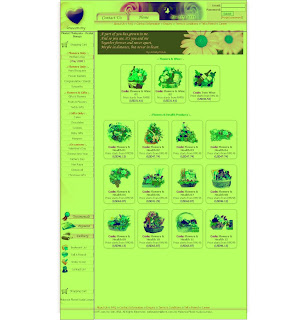
.love.com.mythis website have very simple layout. their corporate color is pink color and have their logo with red heart shape on the top left hand side.
this florist have nationwide delivery service and also have their own shop.
for the information that they have, they put in category and arrange it nicely to make people easy to see the product. for the target audience is to adult and company.
for delivery service. they have the delivery team, the area that they deliver, customer contact and last order schedule. they have free delivery time and also have time that only accept on line and phone inquiries.
for the layout design. the button all are in left hand side and have two buttons on the top, home and contact us. for contact us, it have 2 button. 1 in the left hand side.
in main page, it have flash banner that show the product. right hand side is for log in and show the best seller product.
for the menu. when you go inside it will show you all the product, but in category.
for gridsystem that they use, it use 3 columns in main page, for the menu page it use 2 columns.


2.
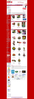
aiflorist.comfor this website, their corporate color is red and dark purple. their logo is on the top left hand side.
they have nationwide and international delivery service, but only in singapore.
here they have budget price to shop.you can choose the range and it will show you all the product. but its so messy because they don't categorize in group.
they also have shop in color and type of flower.
and have converter currency
for this florist website i think is unique, because they have e games here. can entertain customer when want to shop. the target audience also for adult and company. they have 2 hours express flower and send e card.
for delivery service, they divide in area. for free area only three places. for the rest have to purchase minimum RM150.
for the layout design. main page have flash banner, on the left hand side is for the button and right hand side for promotion, they also show the the best seller and offers product.
for grid system, it use 2 columns in every page.


3.
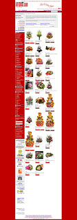
readyflowersfor this florist have many branches in malaysia. it also have worldwide delivery service. their price is charge in USD.
for the information they arrange it nicely and put in category. they have budget price, shop with color and type, is same like other competitor.
the advantage of this florist, they have corporate account, if have the corporate account you will have 10% discount depend on the value.
and also have ordering tracking that to check our purchase. and ask question to the operator.
for the delivery service, they have the time to send all the order, like monday to friday they have send all by 1 pm.its depend on the day.
they also have discount, voucher and reward points. if you have register to this website, you will have 5% discount for all item and will get additional discount with voucher.
for reward points, it will added when you have complete purchase and you also can redeem it.
for the layout design, is very simple design, their corporate color is orange and logo with flower on the top left hand side. for main page they also have flash banner and the promotion.
for grid system, it use 3 columns and it is same for every page.


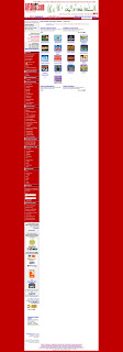
 This for main page.. please comment it ya..
 for the main page it will have flash banner.

 this is for the product page, fruit basket


