1.Meet
sarah hylandfor this site the navigation very simple and still using the same background, only the content change.
when roll over the button, something come out and the word highlighted with yellow color.
and this site also have the same navigation in the bottom, it make user easy to go to another page, no need to scroll up and choose the button.
this the main page.

this for the navigation

and this is the bottom navigation

2.shopfashionisland
for this site, it have 2 navigation
1st is on the top and the 2nd is on the left hand side, for the left hand side navigation it have drop down menu. when roll over the button it change the color, but when you go in other page, it didn't show us where we are in now. so can make user confuse, and it have many sub page.
for the other page it still use the same color and background.

for the drop down menu

3.
rosefui like this website..hehe..
this site she design like a diary.. and it have 2 navigation,
we can click on the top or inside the diary, also same when roll over change the color and it the
button go down.
the button inside the diary she underline the word and put in different color..

i like her design..the mood and the color..
hehehere is her portfolio and her current project


 mainpage
 aboutclay page
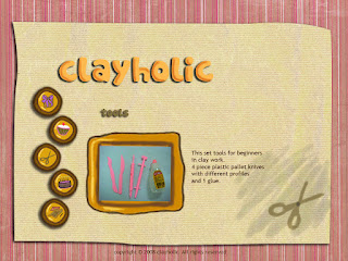
 tools
tools tutorial
 contact
 this is for main page
 this is product page
 this is about clay
 this is for tools page
 tutorial page
 contact page

 this for the navigation
 and this is the bottom navigation
 for the drop down menu


